|
 
[If you enjoy the show, consider supporting us on Patreon! You pay a small fee for each episode we publish.]
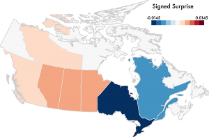
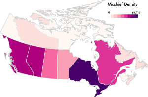
In this episode, we have Michael Correll and Jeff Heer from the University of Washington to talk about a novel visualization technique they developed called “Surprise Maps”: a new kind of map which visualizes what is most surprising in a dataset.
Using their own words: “The idea behind Surprise Maps is that when we look at data, we often have various models of expectation: things we expect to see, or not see, in our data. If we have these models, we can also measure deviation or difference from these models. This deviation is the unexpected, the data that surprise us.”
On the show we talk about how they came up with the idea for Surprise Maps, how they work, and potential applications and extensions for the technique.
Enjoy the show!
Data Stories is brought to you by Qlik. Are you missing out on meaningful relationships hidden in your data? Unlock the whole story with Qlik Sense through personalized visualizations and dynamic dashboards which you can download for free at qlik.de/datastories.
Links
Related episodes
|


.png)
 More
More
 Religion & Spirituality
 Education
 Arts and Design
 Health
 Fashion & Beauty
 Government & Organizations
 Kids & family
 Music
Music News & Politics
 Science & Medicine
 Society & Culture
 Sports & Recreation
 TV & Film
 Technology
 Philosophy
 Storytelling
 Horror and Paranomal
 True Crime
 Leisure
 Travel
 Fiction
 Crypto
 Marketing
 History